Get Started
Logo
Logo
Logo
Logo
What is Framer?
Framer is a web builder for creative pros. Be sure to check out framer.com to learn more.
Is it easy to learn?
Framer is the fastest tool to build sites with, because you can ship your design immediately, instead of having to rebuild your design in code or a second tool.
Do I need to code?
Framer is an end to end tool that lets everyone design and ship web sites. You don’t need a frontend team or web programming course. Just basic canvas skills.
© Framer Inc. 2023

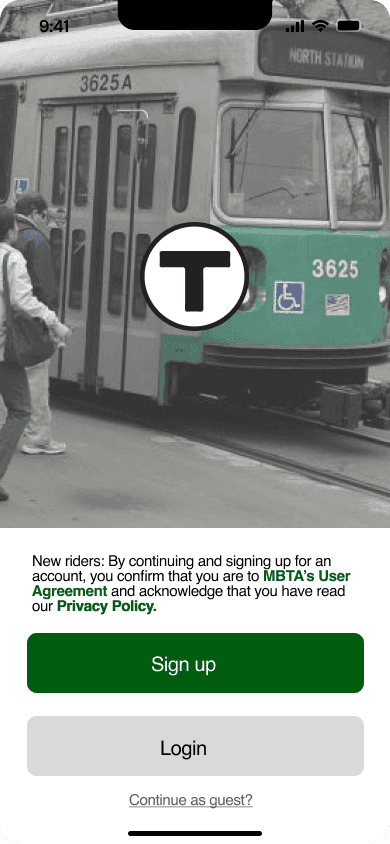
My Charlie App
YOUR TRANSIT & CHARLIE CARD GUIDE TO BOSTON
MOBILE APP | TRANSIT | PROPOSAL
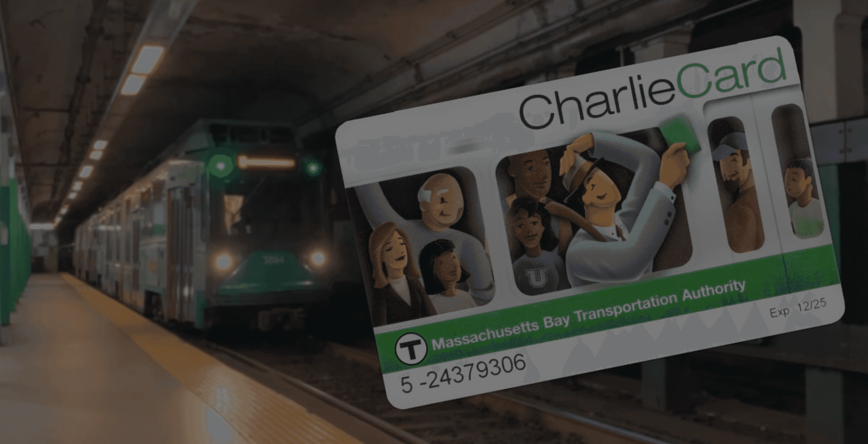

My Charlie
App

Your only app for Boston Transit.
Explore Boston at the palm of your hands.
Hassle free travel and reloading of card.
The brief: "My Charlie App" is a Transit Oriented app in Boston, MA, to streamline
Charlie Card by introducing digital recharging, thereby eliminating the need for
physical queues and reliance on traditional payment methods.
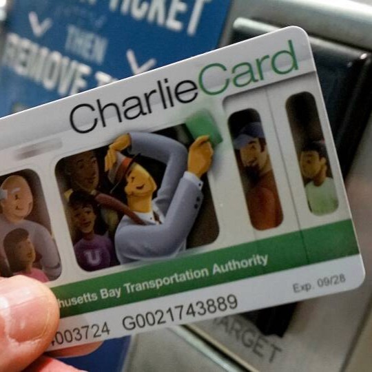
Problem Statement
Charlie cards make using the MBTA very easy, but in today’s technologically digitized world, waiting at only physical kiosks is a pain. Recharging only through debit or credit cards and being unaware of lack of funds in the card until tapped is a huge set back in the fast-paced life of most commuters.
MyCharlie: An application for all your Charlie Card Needs
My Charlie is the only transport application, which allows you to recharge your Charlie card digitally no longer having to wait in queues or at the kiosk to charge your Charlie cards.
Solution

MY ROLE
Design & Prototype
Lo-fi wireframes, conceptual development as a sole designer.
Refined features for the hi-fi prototype in Figma, and interaction
design of the high-fi prototype.
Research
Conducted remote and in-person user tests with the 10 user
groups to understand their pain points
Led recruitment of survey participants, and co-designed an evaluative survey.
THE TEAM
1 Designer
2 Product Managers
TIMELINE
Project
Sept 2022 - Dec 2022
TOOLIKIT
Design & Research
Figma
Adobe XD
Adobe Illustrator
Photoshop
Balsamiq Wireframes
Boston Travel Companion
Explore Boston with your fingertips at your service
Jump to Solution >
View Prototype

80% liked the app
These people were of the opinion that
such an app will help improving with the
implementation of this app.
target audience
4/5
participants
would use the app
due to it's features.
80%
users could complete all assigned tasks during user testing.
test
45%
of the participants
found the app
useful.
empathize
iterate
User Testing & Impact Highlight
BACKGROUND
People of Boston use the Charlie Card. However, the limitations of Charlie cards are a pain point.
In 2012, MBTA announced plans to introduce tickets that could be purchased and scanned on smartphones.
We conducted field research among students at Northeastern university to understand their pain points and preferences. Being a student at Northeastern, we, as a team, could relate to the pain points of the people we interviewed.
However, to ensure there were no biases in our design, we considered the target audience before making any design decisions. We found many students had similar opinions on facing issues with recharging their Charlie Card and constantly having to carry a physical card.
How might we provide a digital solution to solve the
problem of recharging your Charlie Card at a kiosk?
PAINPOINTS
People of Boston use the Charlie Card. However, the limitations of Charlie cards are a pain point. In 2012, MBTA announced plans to introduce tickets that could be purchased and scanned on smartphones.
Our group formed assignments to grasp various elements of the transit experience by studying a range of users, transit structures, and distinct locations in Boston, in order to unravel the users' key areas of difficulty.
01.
Unable to reload Charlie card on the go.
02.
Physical Card keeps getting misplaced.
03.
Needs a digital solution.
Final Design
Highlights
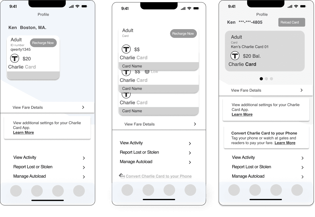
The "My Charlie" app has transformed Boston's public transit system. It offers digital recharge, real-time balance tracking, management of multiple cards, instant alerts, and customer support. It's user-friendly and accessible, including for the visually impaired, and ensures security with two-factor authentication.
This final prototype aims to make public transportation more interconnected, convenient, and efficient.
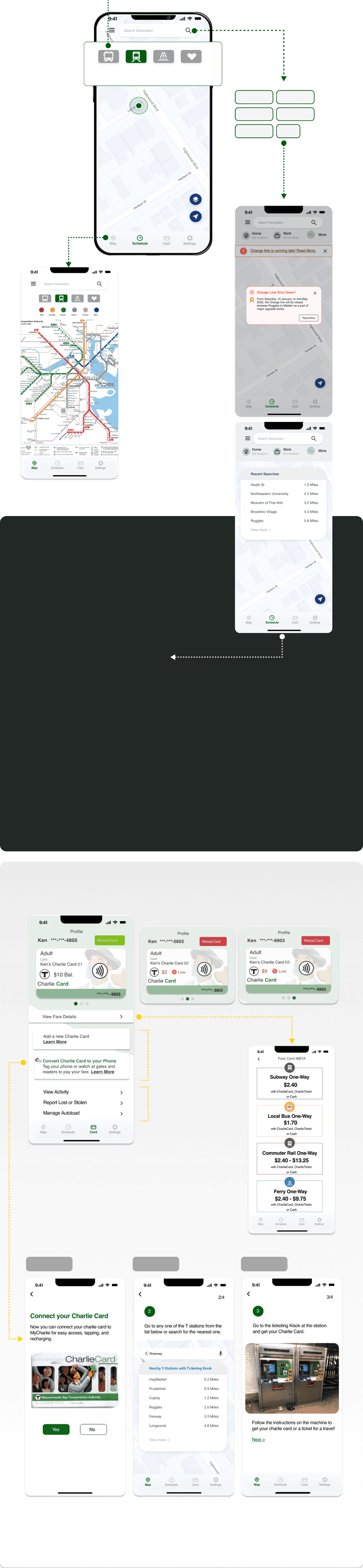
The functionality of the app along with its multiple functions were transformed into a structured diagram to improve comprehension of the user navigation. This offered us a scaffold to build the preliminary design ideas and translate them into wireframes.
User Flow


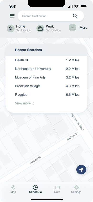
Orange line is running late! Read More.

Chalie
Card
Chalie
Card


*
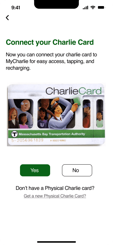
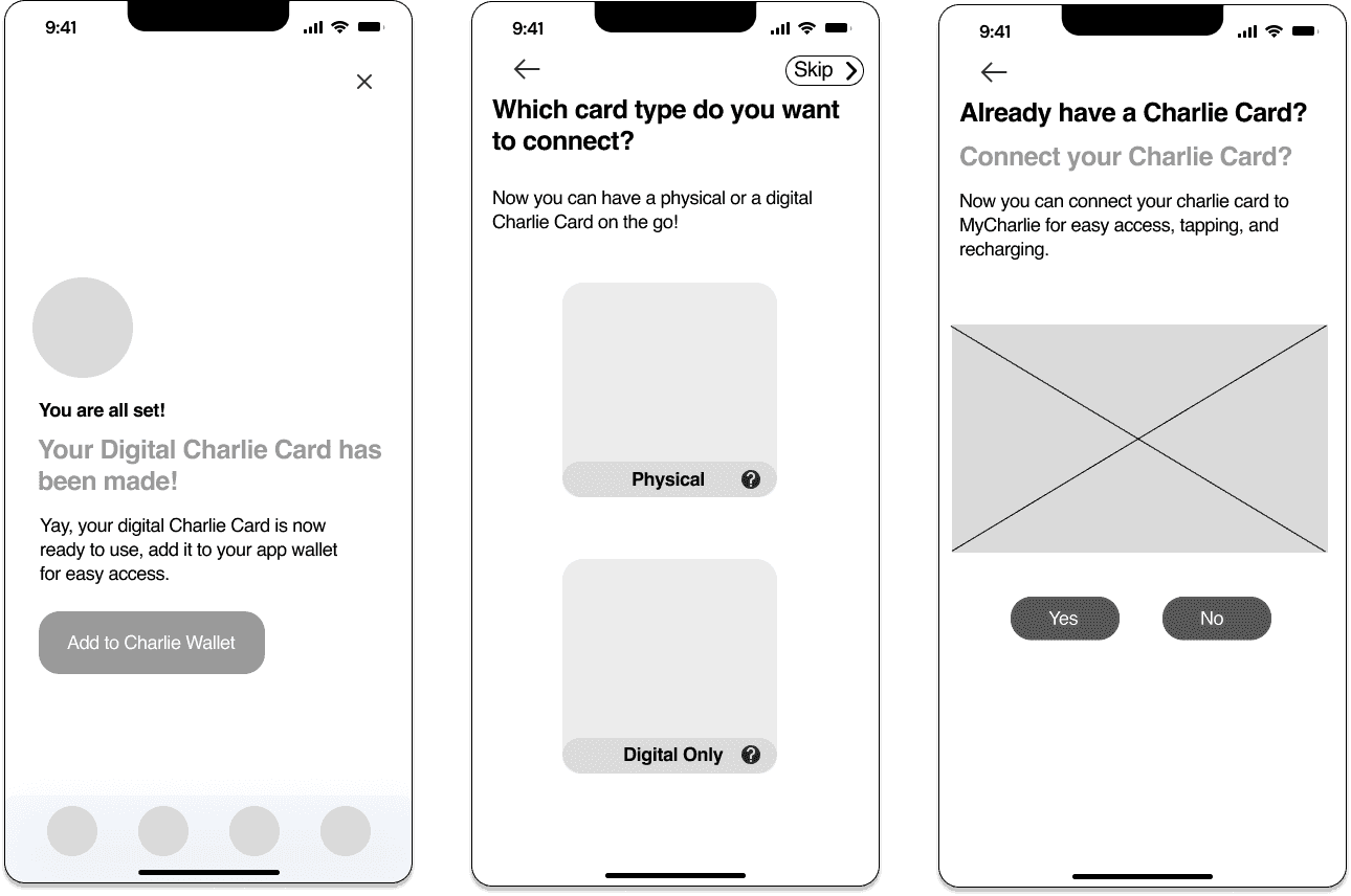
Add Physical Card Anytime: Seamlessly integrate your physical Charlie Card with the app at any stage, ensuring effortless management and accessibility.
*
Customizable Autoload & Security Settings: Tailor your experience with flexible settings for activity autoload and enhanced security measures for lost or stolen cards, keeping your commute worry-free.
FEATURE 2
View Train
Schedule
FEATURE 1
Mange your
Charlie Card
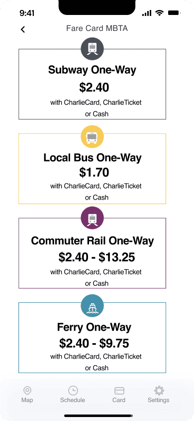
MBTA Fare Card
Charlie Card Screen
Connect Card
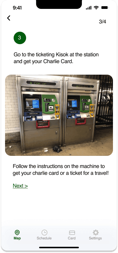
Find T Station
Find Kiosk
These screens guide you to find a Charlie card.
Don't have Card:
Steps to help you find a
Physical Charlie Card.
*
Route Discovery & Timing Flexibility:
Search for your destination to access various route timings. Utilize available filters to refine your search based on preferences, ensuring a tailored commuting experience.
*
Timing & MBTA Schedule:
Overcome the uncertainty of public transport schedules. Our feature provides real-time updates on bus and train arrivals, keeping you informed and on schedule.
*
Comprehensive Route Itinerary:
Receive a detailed route itinerary to fully understand your journey, including specific stops and transfers. Designed to assist both tourists and regular commuters in navigating their way effortlessly to their destinations.
MBTA Map Screen
Transit Route Map > Schedule a Train
Chalie
Card
Chalie
Card
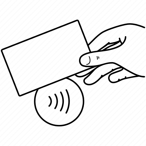
QUICK TAP:
A quick button to allow you
to tap your card on the go!
Bus
Tram
Ferry
Favorites
Search
All
Locate a Train Station:
Locate the nearest T station where you can get a Charlie Card
Last step to get the card:
Seamlessly integrate your physical Charlie Card with the app
FEATURE 1
Schedule
your journey
TRANSIT ROUTES
Orange line is running late! Read More.
Creating a flawless digital MBTA.
Behind the design,
The method of creation, the WHAT, HOW and WHY for our design.

Using Lean UX & Agile Process
Brief And Estimation
Design Team Process
Information Architecture & Wireframes
Feedback
Usability
Testing & Validation
Interaction & UI Design
Calendar Update
Satisfaction Survey
Final Delibarables
Discover
Validation
from Target Users
Kick- Off
We undertook field research to comprehend the MBTA, and conducted interviews to grasp challenges encountered by both service providers and users. This facilitated our identification of areas for enhancement. Through this procedure, our aim is to gain a thorough understanding of the present state of MBTA and discover avenues to improve the service experience for all stakeholders involved.
Decoding MBTA
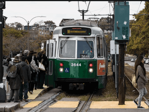
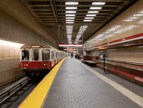
Boston's T operates both over and under ground, yet there aren't any Charlie Card Reloading kiosks at the overground stations.

The transportation infrastructure includes extensive routes and a broad grid, hence a significant populace relies on mass transit for their everyday jobs.

The transportation infrastructure includes extensive routes and a broad grid, hence a significant populace relies on mass transit for their everyday jobs.
The kiosks are solely accessible at the subway stations that are quite distant from one another, hence numerous individuals don't bother to pay for the journey or fail to catch their ride.
The transportation infrastructure includes extensive routes and a broad grid, hence a significant populace relies on mass transit for their everyday jobs.
Physically tapping a Charlie card for access often leaves individuals stranded when their card balance is inadequate so they have to search for a kiosk to top up the card.
Targeted User Interviews
To initiate the project, we held several discussions with current users of Boston Transit, and Charlie Card. Following our field research, we conducted two face-to-face interviews to obtain a deeper survey and feedback, with the aim of discerning possible areas of opportunity and categorizing them into solution compartments.
Outcome: This effectively guided us in creating the MVP features for our app.
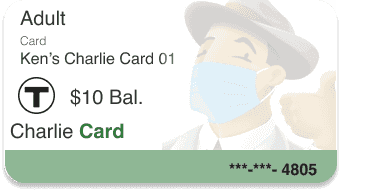
Ken McCormick:
A working professional who utilizes the MBTA transit system for commuting to his job daily, he holds the belief that it's the quickest path to his workplace.
Converting findings to
build User Personas
Kai Silverstone:
A Northeastern University student who utilizes Public Transit for her daily commute to campus for lectures.
UNDERSTANDING USER PAIN POINTS
The user's journey proved to be a paramount
way of understanding the prime features
of the My CharlieApp.
We wanted to form a deeper understanding of our users' goals, needs, experiences, and behaviors. So, we created 2 personas for each of our user segments. They were based on user interviews and surveys, and we kept updating them throughout the project as we gathered more data. We used these personas whenever we wanted to step out of ourselves and reconsider our initial idea.
FIND A TRAIN
CONSIDERATION
PROBLEM OCCURS
DOWNLOADS
MY CHARLIE
WORK TIME
SCENARIO
Ken is preparing to go to work. He has a crucial sales meeting this morning and must arrive on time. While eating his breakfast, he checks the transport app/site to see when the bus is leaving from his closest station and if there are any planned outages today.
EXPECTATIONS:
Easy interaction with the transport app/site
Clear information: bus departure, bus arrival, bus number
Truthful information
Getting ready for job. Must arrive punctually, locates a train using Google Maps. Organizes everything and departs home.
The data from Google Maps was remarkably precise.
Figuring out the correct train schedule was a breeze.
He's delighted as he is now assured of reaching his office punctually.
He realizes his Charlie card's credit is insufficient. Pressed for time, he aims to top it off without needing to commute to a different T station to use the kiosk.
The subsequent train is due in 8 minutes, yet he won't manage a kiosk visit and return in time.
Anxiety over missing his critical appointment builds; hailing a cab is a costly option.
Search online for ways to refill Charlie's card.
Learn about the Charlie Card. Download the respective app.
After logging in, he enters his payment info and other details.
He promptly manages to top up his Charlie Card online, all before the arrival of the next train in approximately 8 minutes.
The apps main job succeeded, his card got reloaded.
Allowing him to use the ready transportation without significant delay.
He considers this app immensely valuable.
Will I get on time for my buss?
TRUST
HAPPY
FRUSTRATED
WONDERING
HAPPY
I hope this app helps
me recharge my card asap
How can I get to work on time now?
I wished I could recharge
this card online, Arghhh.
Why don’t I have
balance in my card???
What if the bus gets delayed like yesterday?
Was the information accurate?
Are there any planned outages today?
What is the quickest way to find when the train leaves?
What time should I leave my home?
Well, this went well, Finally I am at work on time
Okay wow, this was quick, now the next T is arriving
ACTIONS
WHAT DOES THE CUSTOMER DO?
CUSTOMER THOUGHT
WHAT IS THE CUSTOMER THINKING?
PHASE OF JOURNEY
CUSTOMER FEELING
WHAT IS THE CUSTOMER FEELING?
SCENARIO & EXPECTATIONS
WORK TIME
RESEARCH AND PLANNING
WALKING
PROBLEM OCCURS
DOWNLOADS
APP
SCENARIO
Kai is planning to attend university today; she plans well in advance and has a lecture to attend today. After she gets out of the house and waits for the T to arrive, after entering the T, she realizes that she doesn’t have enough balance on her card and can’t take the ride since she isn’t even carrying emergency cash. She has to go to a nearby kiosk in the cold to reassure her card, and she will get late for her lecture.
EXPECTATIONS:
Recharge information
Digital method of recharging the card
Wakes up in the morning
Preparing for her lecture
It’s super cold outside
Finds the schedule that is suitable for her
Leaves home
Walking to the station
Waits for the T
Is in a hurry
The T finally arrives, and Kai taps her Charlie Card, only to realize that she needs more balance.
She is asked to step out of the T and hence loses a lot of time.
She worries that she will get late and has to walk to the kiosk to recharge her card.
She searches online how to recharge her Charlie Card fast or any other alternatives
She finally comes across the MyCharlie app and downloads it.
She finishes logging in and connecting the Charlie Card and payment methods.
She recharges the card.
The next T is almost arriving, and Kai has recharged her Charlie Card
She taps her card, and Voila, she has balance and can travel now.
Why is the T so late today?
TRUST
HAPPY
FRUSTRATED
WONDERING
HAPPY
Can I still arrive on time?
I hope this applicaiton is easy to use and helps me !
Why is it delayed?
What if the T gets delayed like yesterday?
Why is Google Maps so confusing and innaccurate?
I hope I reach to the lecture on time!
Why is it so cold today!
What time should I leave my home?
Well, this went well
I hope this digital recharge works.
ACTIONS
WHAT DOES THE CUSTOMER DO?
CUSTOMER THOUGHT
WHAT IS THE CUSTOMER THINKING?
PHASE OF JOURNEY
CUSTOMER FEELING
WHAT IS THE CUSTOMER FEELING?
SCENARIO & EXPECTATIONS
WIREFRAMING & IA
We used wireframing for early testing of our
design and prototypes, to understand what
works best for MVP features.
We wanted to form a deeper understanding of our users' goals, needs, experiences, and behaviors. So, we created 2 personas for each of our user segments. They were based on user interviews and surveys, and we kept updating them throughout the project as we gathered more data. We used these personas whenever we wanted to step out of ourselves and reconsider our initial idea.
Card wallet with
one card only
Idea 01
Card wallet similar to
Apple Pay wallet
Idea 02
Card wallet swipe
for multiple cards
Idea 03
Targeted Problem:
Recharge and
tap card page
Targeted Problem:
Connect your current card
The Design System
17pt.
17pt.
17pt.
17pt.
Helvetica
Helvetica
Helvetica
Helvetica
Using the 60-30-10 color rule:
The 60–30–10 is a very simple rule for creating well-balanced color palettes. The idea is simple —when you choose a new color palette, the 60% of the palette should be dedicated to one color (usually, it’s a neutral color), another (complementary) color makes up 30% of the palette, and a third color (accent) is used for the remaining 10% of the design.
Call to Action
Other Buttons
Call to Action
Error Buttons
How we will use it?
Firstly, we had to set our color ratio based on the palatte.
We set the dominanat hue (60%) to Light Blue, (#F2F4FF)
Secondary (30%) to Green (#005C0E)
And the accent color (10%) to Green (#005C0E)
Background (#FFFFFF)
Primary
60%
#9D9D9D
Secondary
30%
Text
(#1C387C)
Secondary
30%
Accent
10%
#005C0E
USER TESTING FEEDBACK
We spoke to 15 people, who were daily
commuters of the MBTA, and tested the
hi-fi prototype with them.
Some verbatim feedback:
"clean and modern"
"no hindrance to search"
"I'm able to find what I need"
"contact and keyword"
"suggestions are helpful"
Upon finalizing the revamped interface, we initiated Flash Feedback rounds with our My Charlie mobile user community. We requested them to give the new interface a whirl, and to our utmost glee, every participant could spontaneously commence and conclude their search tasks, comprehend and employ the novel functionalities, encountering virtually no obstacles throughout the process.
Key findings from the user studies we undertook.
The trial engendered some heat maps and mis clicks, thereby delivering us an accurate results and feedback.
View User Research Document >
The design of this app has helped improve Boston's transit system by digitizing it and creating a seamless user experience for
travelers and visitors. it will help imporve and address the current pain point of transportation.
Reflections: Ensuring a smooth travel experience for Boston
Transit System users, while gaining insight into their difficulties to
create a practical application.
🚇 Collaboration and Work
We collaborated with many students to conduct diverse tests, which enabled us to grasp user difficulties and gain a comprehensive understanding of the MVP features for this application.
📱 Proposal to the MBTA
This application is now set to facilitate the Boston transit system and was even forwarded to the MBTA as a future suggestion we might want to incorporate in enhancing the Boston transportation network.
Other Projects
All Projects

Webiste & Mobile App Design
Project Stree
Redesigning the spotify podcast experiecne
Spotify Podcast Redesign
Ai- Powered Design Tool
Ada Tech x PUMA
Introduction
Context
Impact
Process
HandOff: Admin Settings
HandOff: Sales Dashboard
HandOff: Message Center
Test
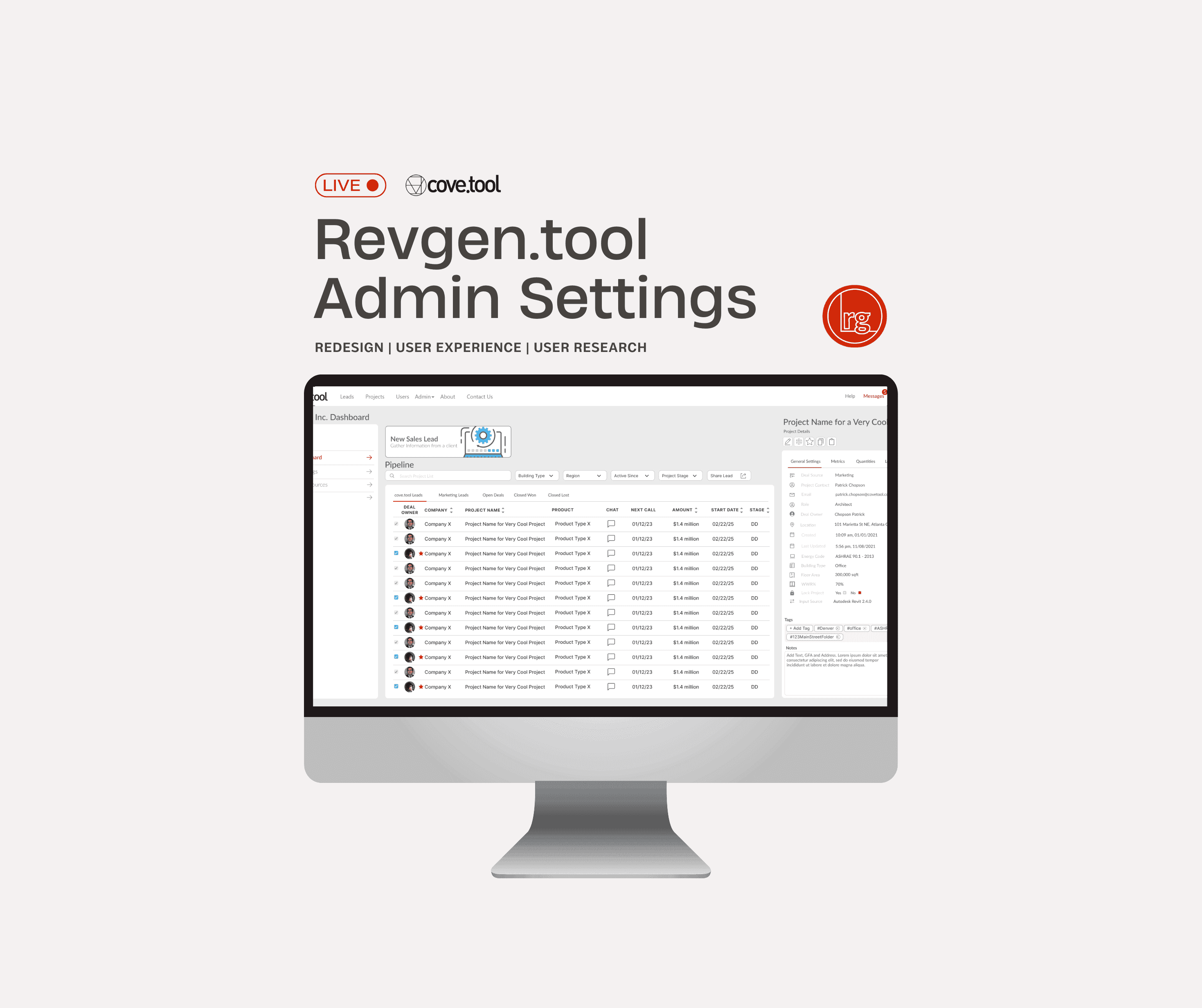
revgen.tool
admin settings
redesigning the admin settings for the revgen.tool
Product Design | USer Research | Experience design


introduction
In 2023, we initiated a targeted redesign of the admin settings for the RevGen.tool within Cove.tool, a revenue generation and analysis application initially developed for small businesses.
As its user base diversified across various industry sectors, the existing experience struggled to accommodate the emerging use-cases and scalability requirements. Our redesign efforts aimed to modernize the interface for different use cases, enhancing performance and flexibiltiy.
MY ROLE
Design
Collaborated with the team
Identified target user categories and user hierarchy structure
Breaking down the different use cases into actionable items
Created wireframes, user stories, mockups & style guide
Collaborate
Worked alongside back-end and front-end developers
Conducted user tests with the 3+ user groups to understand their pain-points
Semi-structured Interviews, Usability Testing, Competitive Audit, Sketch, Zeplin, Adobe Illustrator, draw.io
THE TEAM
2 Designers
1 Product Manager
8+ Engineers
(back-end +
front-end)
TIMELINE
Research & Design
August 2023 - Dec 2023
Deploy & Test
Present
An innovative format, fresh interface,
and a novel functionality
10+
2
50%
8.2/10
Hi-fidelty prototype
screens for the MVP
New clients signed up for revgen.tool post feature launch
Increase in usage of admin settings in rate of conversion
User satisfaction rate after revamping the platform.
Collaboarated cross - funcationally
Attainted User Satisfacton
Built an intutive redsign of the product suite
IMPACT
LEARNINGS
KEY TAKEAWAYS
We've achieved a major milestone with the redesign of this feature.
Key features have been streamlined for better accessibility while maintaining the suite's robust capabilities.
The new design emphasizes ease of use, efficient navigation, and a more aesthetically pleasing visual layout, aligning with modern UX principles.
We attained a high level of user satisfaction by ensuring that we attain maximum user satisfaction by tackling all pain points.
It's a great opportunity for me to collaborate with designers, engineers, and marketers to create a redesigned interface. As a result, our provider received positive feedback from both stakeholders and customers.
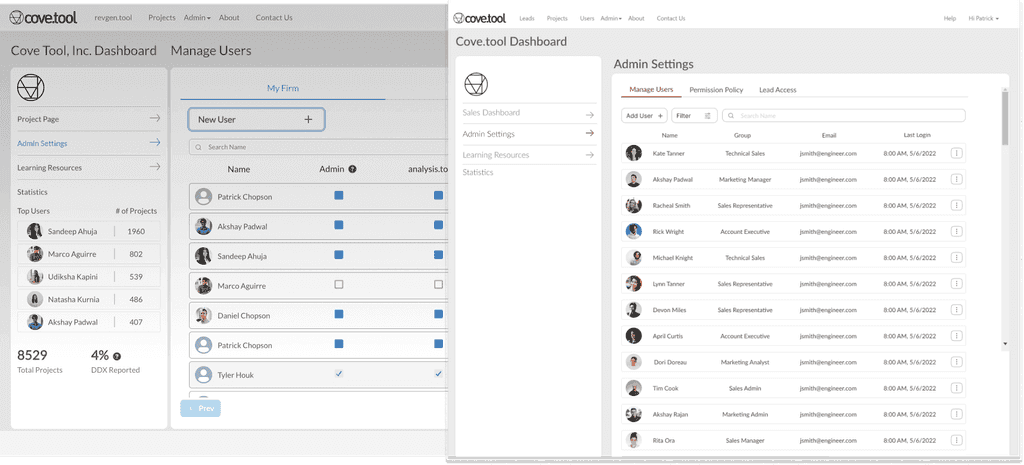
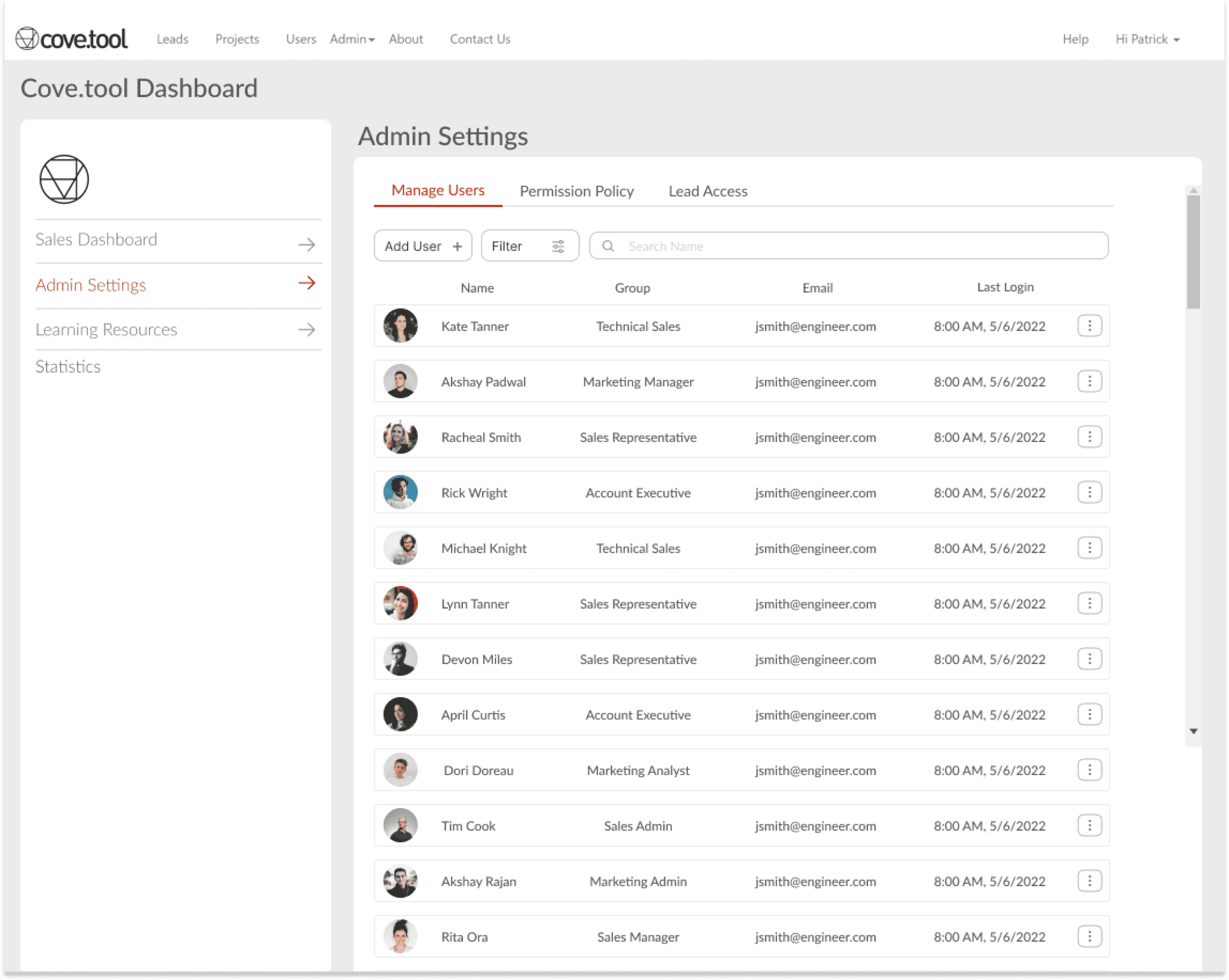
Current Admin settings Interface
📈 Limited Scalability and usability
issues
⛓ Complexity hindering flexibility
😒 Complicated workflows &
user experiences across profiles
🖥 Dated user interface
The current experience didn't provide assistance with
scalability since the number of users significantly increased.
Inconsistent experiences with our admin settings are affecting
user productivity and satisfaction across different roles and profiles.
BREAKDOWN OF THE PROBLEMS IN THE INTERFACE
Complex admin workflows and system intricacy make
adapting to user requirements and customizing
access controls difficult.
The current user interface isn't designed to facilitate necessary
changes for the type of functions and decisions it needs to make.
We kicked off the process with a comprehensive experience review of the
current experience with the product triad.
To tackle this problem, we utilized the S.T.A.R approach.
This involved identifying the context, user groups, tasks, and challenges involved.
We then mapped out the actions in the user journey and user stories to gain a better
understanding of the problem. By doing this, we were able to generate design ideas to
address the issues at hand.
PROCESS

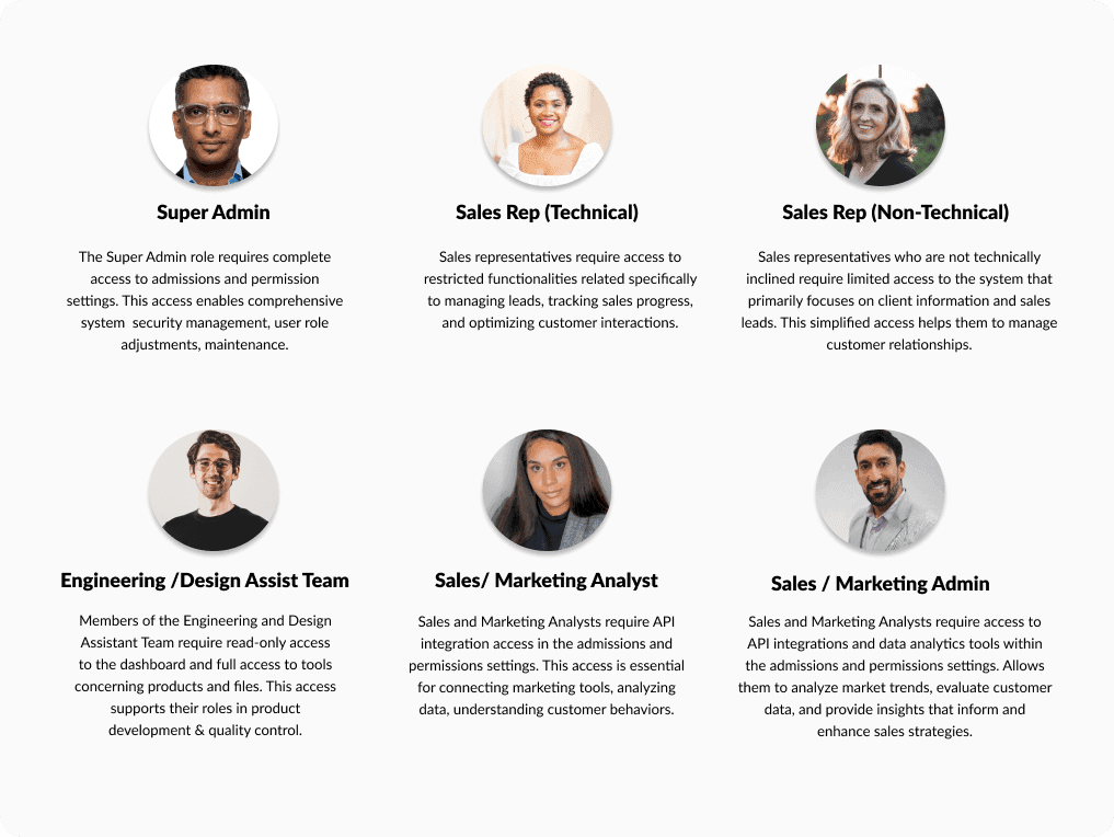
The permission system (what) caters to a diverse user base, providing tailored access and restrictions (why) to super admins, business owners, administrators, designers, technical and non-technical staff, and marketing and sales representatives (who).
This system streamlines operations and accommodates overlapping functionalities across all departments (how).
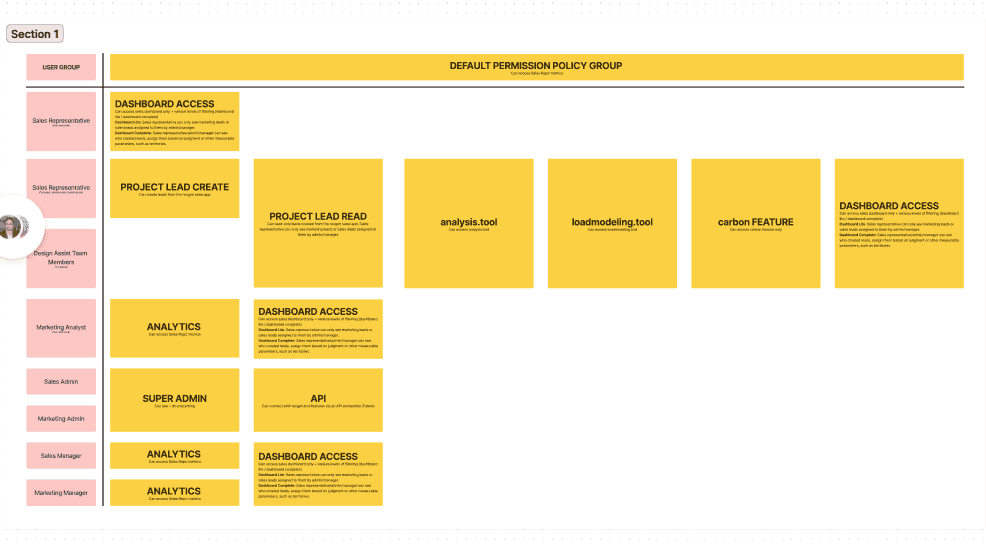


IDENTIFYING TAREGT USER GROUPS
The admin settings are used by different
personas across the company. In addition
to the super admin, sales reps, designers,
and assistants also have access.
"Our user base includes super admins, business owners, administrators, designers, technical and non-technical staff, and marketing and sales representatives. However, since the permissions, is widely used across the company to grant and restrict access, our personas need to be flexible and inclusive of various functionalities that may overlap. functionalities which may overlap.
DESIGN GOAL: FUNCTIONAL | Super Admin
Contextual primary
navigation options based
on user goals
USER SCENARIO
SOLUTION
We've designed a versatilecontrol panel, segmented into three distinct sections to allow for seamless one-directional navigation pertaining to the daily tasks performed by the super administrator.
The super admin has three major tasks.
1. To manage the users (add/delete/change)
2. To view permission settings
3. To give share or change lead access
Organized Grouping of Functions Across Distinct Tabs
DESIGN GOAL: FLEXIBILITY | Super Admin
A customizable admin
dashboard with staff, role
and filters to narrow search
USER SCENARIO
SOLUTION
We developed staff utilities and filtering options, based on group, role, and the capability to efficiently modify/remove or tailor the specific service/group required for viewing.
The super admin wants to oversee the triage, roles, and permissions daily & needs to browse through vast volumes of users and their roles. Discovering the required information can take considerable effort.

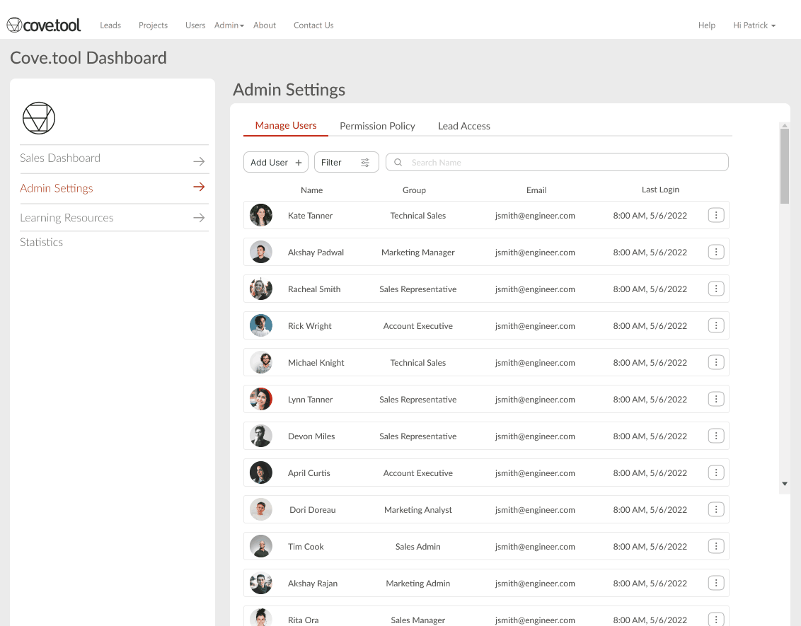
View of the super-admin dashboard with editing access
DESIGN GOAL: FLEXIBILITY | Super Admin
Mange Users:
Ability filter, search, add
or delete a user
USER SCENARIO
SOLUTION
We developed staff utilities and filtering options, based on group, role, and the capability to efficiently modify/remove or tailor the specific service/group required for viewing.
The super admin wants to oversee the triage, roles, and permissions daily & needs to browse through vast volumes of users and their roles. Discovering the required information can take considerable effort.
Streamlined User Management Pop-Up for Efficient Role Modification

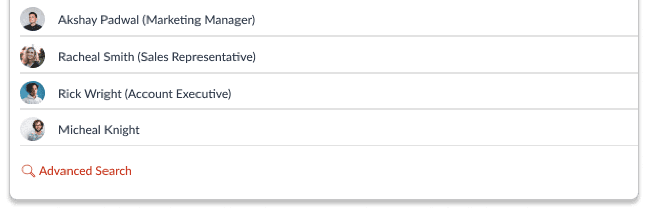
DESIGN GOAL: FUNCTIONAL | Other Users
Sales Dashboard: transfer
& share leads

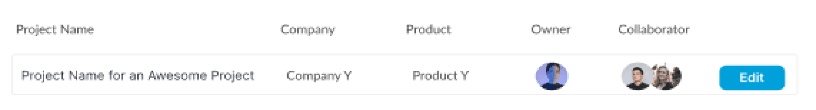
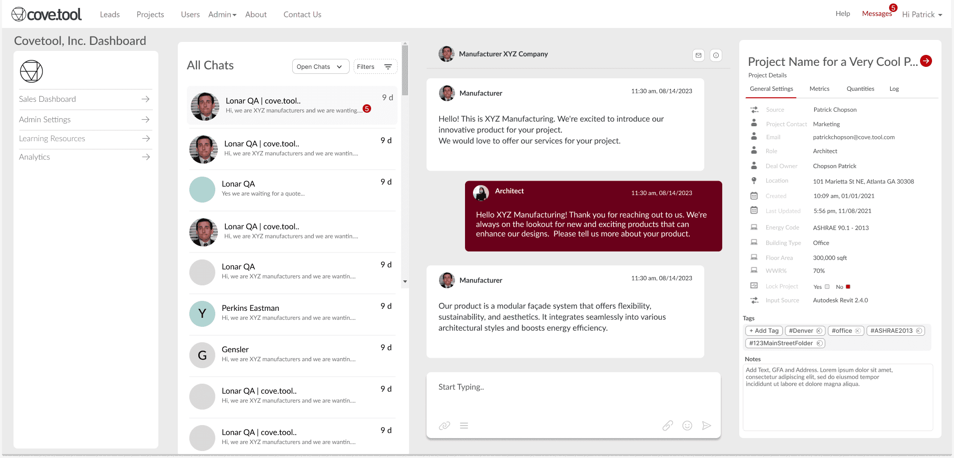
The Dashboard allows users to transfer and share leads, keeping in mind that employees may need to reallocate leads at any time or add collaborators to the lead. Additionally, a project detail panel has been included to provide an overview of the project and the lead, making tracking more effective.
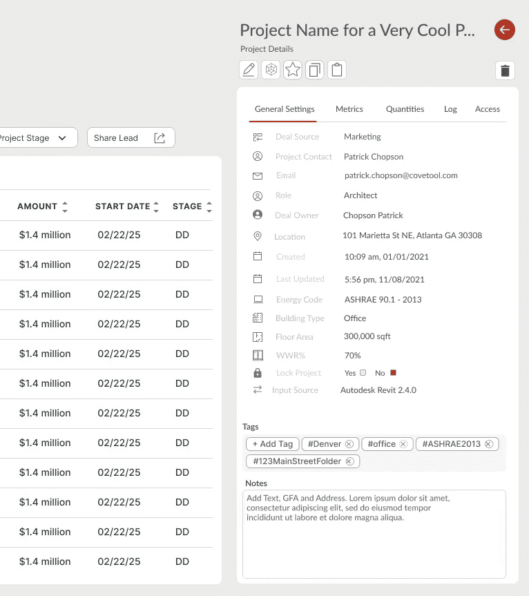
DESIGN GOAL: CONSISTENCY | Super Admin
Details Panel
Get lead information and
project details
USER SCENARIO
SOLUTION
Designed a collapsable information panel with General Settings as the default tab, and additional project specifics like Metrics, Quantities, Logs (prior discussions) and point of Lead Access in the information panel.
An employee seeks insight on a specific lead or project, they'd desire a panel carrying relevant data for diverse aspects of the project.
Expanding and Collapsing Details Panel for Enhanced User Engagement
DESIGN GOAL: COHERENT | All Users
Actionable & informative
CTA's and call outs
USER SCENARIO
SOLUTION
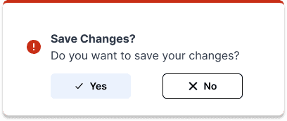
We implemented enhanced IA, logical organization of similar and dissimilar controls and actions, clearer text and simpler methods for web app-wide configuration, for a superior editing experience.
The administrator settings encompass robust controls for arranging roles and access rights. However, due to the abundant controls, numerous organizations and confused users often struggle to fulfill their actions.
Efficient Dropdowns, CTAs, and Feedback Messages for User Interaction

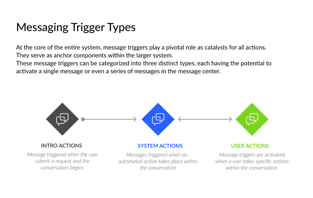
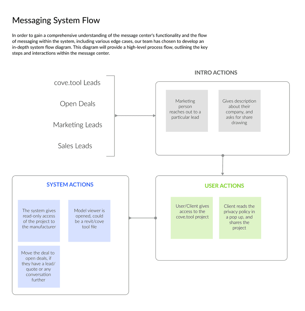
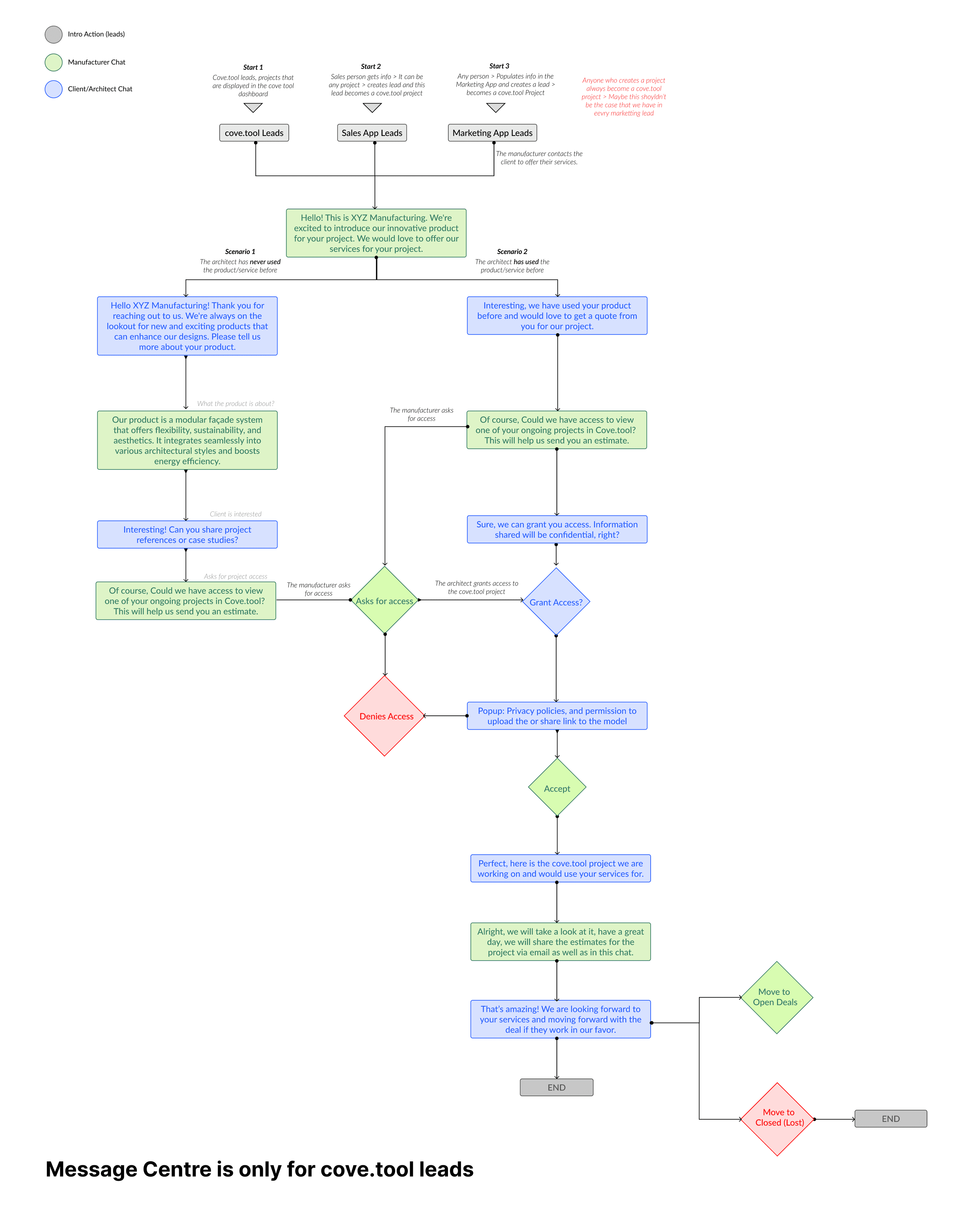
DESIGN GOAL: ALERT SYSTEM | All Users
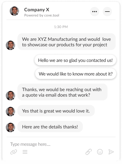
Message Center & Logs
USER SCENARIO
SOLUTION
We've constructed a robust, adaptable notification and alert framework to effortlessly utilize these functionalities, aiding users in staying informed and tracking leads. The logs meanwhile ensure they're continually informed about the lead's progress.
The user aims to engage with the lead, and communicate with them, through logs and notes. The user should also receive notifications and updates as alerts for sharing and transferring of leads.
Optimized Deal Tracking and Logging for Real-Time Monitoring and Management

DESIGN GOAL: COHERENT | All Users
A consistent view of
staff, services and
customer profiles
Robust, consistent profile cards for staff, services, and employees that can be invoked anywhere in the app where the entity appears. These offer a live, informative snapshot of the various roles, descriptions, contact details, engagement, and more. We have also made it feasible to navigate between different actions so that interconnections are understood.


This redesign served as a critical functionality for the revgen.tool, enhancing features, improving user journey and information architecture.
Currently, the feature is under development, has been tested in staging, and will soon be implemented in production.
Reflections: Providing a seamless permission policy and admissions interface for
the increased usage of the revgen.tool.
🤝 Collaboration and Work
Working on my first project working with cove.tool,
I had the opportunity to collaborate with cross-functional teams and understand the design process from ideation to implementation. The experience emphasized the value of teamwork and effective communication in driving successful outcomes.
🧠 Enhanced User Experience
The redesign contributed to improved performance metrics, such as increased user retention and higher conversion rates, demonstrating that thoughtful feature redesigns can have a tangible impact on key business objectives and overall product success.
Other Projects
All Projects

Transit App for Boston
My Charlie App
Website & Mobile App Design | Branding
Project Stree
Ai- Powered Design Tool
Ada Tech x PUMA
Design
Content
Publish
Revgen.tool Admin Settings
Redesigning the Admin Settigs of revgen.tool
ADA Tech x Puma
AI- Powered Tool for analysis made for PUMA
My Charlie App
Transit Application for Boston
Project Stree
Designing branding for web, print & mobile
KA
Resume
Available for Work
Hello! I’m Kirtika Arora. A Product Designer
4+ years of experience in bridging the gap between insights and impactful experiences in
B2B, B2C, and beyond!
See my Work

About
Currently working as
Sr. Product Designerat Tamiland LLC.

I'm based in the Bay Area (San Jose) California
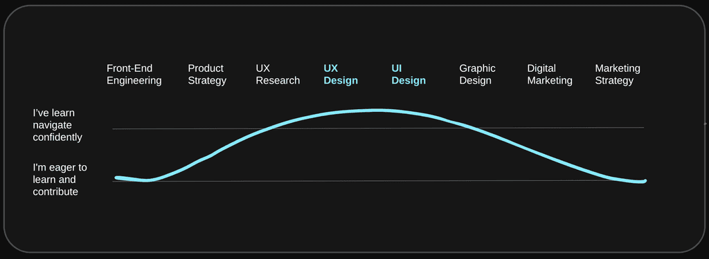
Here’s the spread of my core skills:
I’m also into illustrations, chess, and content creation.
SELECTED WORK
I've cherry-picked some cool projects to show off my UX magic. Check them out – it's like a highlight reel of my design adventures!

UX Design
Website Redesign
Work Experience
Chinatown Stories
Learn more
UX Design

Feature Design
Mobile app
Academic Project
Emotion Sync Mode
Learn more
Feature Design

Design System
UX Design
Academic Project
BKM Design System
Learn more
Design System

UX Researcher
Usability testing
Work Experience
Flux Factory
Learn more
UX Researcher

UX Design
Mobile App Design
Personal Project
YourStyle
Learn more
UX Design
EXPLORATION
I'm like a DIY dynamo, kicking off projects in various realms because, well, why not?


FAQs
A few things potential employers normally ask me
What is your location and timezone?
Are you willing to relocate?
What positions are you looking for?
What is your work eligibility
That was a lot of scrolling, are you ready for some design magic?
Explore
Socials
@Figma
@Dribble
@Behance
@Medium
Hire me
Contact
Kirtika
Last Update * June 2024
Designed by Kirtika Arora • Built in Framer

Hey there! I'm Simrann Gökhan, a freelance web developer based in Montreal. With over 5 years of experience, I specialize in crafting dynamic websites that leave a lasting impression. My skills span HTML, CSS, JavaScript, and more, allowing me to bring your digital vision to life with precision and creativity.
From sleek landing pages to robust e-commerce platforms, I've got you covered. I thrive on exceeding client expectations, whether it's building responsive designs or optimizing for SEO. I take the time to understand your goals, ensuring the end product meets your needs.
Located in Montreal, I draw inspiration from the city's diverse culture and innovative spirit. Let's collaborate and turn your ideas into captivating online experiences!
Available for Fulltime
Available for Fulltime
Style Guide for AdsGency AI